
There are words I try to never use...hate, ugly, fat, stupid...but the worst of all of the "four letter words" to me is match. Match, as in, "Oh my God, you can't put that there! It doesn't match!". I do get it though. I understand that that's how we're raised for the most part. It's the "Garanimal" syndrome. Like goes with like. Stay within the lines. Bleh. It leaves such a bad taste in my mouth. So, here's what I propose...try to replace the idea of "matching" things in your home with the idea of things "working together".
Here are some great examples
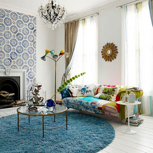
Let's take a look at the sofa here. I mean, if you were looking at fabric swatches, many people wouldn't think that these match. But, do they work? Absolutely! The more you mix color and pattern, the more interesting things get...the more it appears that you know what you're doing and not just following a formula. Mix in this great tile/wallpaper around the fireplace and you really start to see that on paper lots of things work even if they don't match.
(via freshome)

via rashida jones

So, let's say that the floral fabric in the forefront of this pic used as a drape was the first one you chose to build a project around. You love it and can't wait to choose the rest of the fabrics, furniture and accessories. And then your designer (or very stylish and creative friend) suggest you use this great shade of blue on the walls. You look at the floral fabric...then at the paint swatch...scrinch up your face as you look back at the fabric and you say, "But it doesn't match. There's no blue in the fabric!". Sound familiar?
Now, look at the overall space that's been created here in this pic and ask yourself, does it work? I think it would be hard to argue that it doesn't. Because the scale of the patterns is varied and the colors complement one another, this space just seems really fun and collected over time. Another thing that grounds it is the use of black. Every room need a bit of black!
via domino mag

Even though we have a very limited color palette at first glance in this space...whites, shades of blue and black, they took some fun risks with pattern that some people might think don't "match". But they work! Notice the corally color on the wood portion of the chair, the pop of the same color in the book on the table and the yellow in the flowers? These are the additions that bring the room to life and begin to open up the color palette to have even more fun. Take a look at the other side of the same room in the pic below.

If I presented to you this wallpaper, the mirror, the storage boxes and the bench fabric would you trust me? Would you trust yourself to do this? I hope you would. Garanimals be gone!
(above 2 photos via erin valencich)

A perfect example of eclectic and collected items working beautifully!
via decorno
2 comments:
I love the room with the blue walls!! I like mixing it up but I'm always afraid it will look like a mixed up mess instead of a complimentary and collected look like you mentioned...
Ah, Kell! Just trust your gut and it all works well in the end. I promise!
Post a Comment