Showing posts with label Vern Yipp. Show all posts

Monday

Design (Co)Star(s)?

Design Star, Episode 4, was, dare I say, a bit more interesting this week. Though, lest you think that implies the concept for this episode was fresh and new...think again. Alas, one more week of, "Hey, everybody, pick a random object that you're drawn to (in this case, a flower) in hopes that you will be designing your own space around this very-personal-to-you-object and then we're going to throw all of your team together with all of your items now in a bunch and make you work together to create a space that represents all of your random crap as a whole." Yeah, that's pretty much what happened yet again this week. Hey, HGTV! Can we get an individual challenge?! This show is supposed to be about finding a Design "Star" not co-stars! So frustrating to me. However! I will say that the designs seemed a bit more inspired this week, don't you think? So, here was the premise:

"This week, the designers find inspiration in flowers. The nine remaining designers are challenged to create a studio space inspired by their team's bouquet. Each designer selects one flower and uses it as individual inspiration in the team's overall space. As the studio space blossoms, one designer has difficulty catching his breath, while another struggles to find inspiration altogether. A massive mistake threatens one team, while the other struggles with a dominant personality. In the end, the judges surprise everyone with an unexpected decision and one designer is eliminated from the competition while eight survive to see another day of design." (HGTV.com)


"Using the tulip as inspiration, Tom focuses on the luminosity one sees when light shows through a flower's petals. He chooses furnishings that allow a lot of natural light into the room to represent his inspiration. What do you think about his design?" (hgtv)
 
Well, thank you for asking HGTV. First, could Tom be any more handsome and the epitome of what a fabulously successful designer should look like? Reason #67 why I could never be on this show. I would forever look like the rumpled and dumpy assistant to the designers and I'm fairly sure that's not quite the look that they're hoping for in a "Design Star". Anyhoo...back to the show...I think Tom successfully was able to incorporate his flower into the space. Although it's really obvious and could have been deemed as too obtuse, I love how that floor lamp is so reminiscent of a droopy tulip. And I love me some droopy tulips!


Tom was also the mastermind behind this bookshelf...at least I thought he was. Now that I'm writing this and researching it a bit, it seems that Michael is getting the credit for it. I'm confused. Because they were dealing with a studio apartment, this was an interesting way to separate the sleeping and living areas. I give him props for actually conceptualizing the whole piece and not just going out and buying one...although, that's exactly what I would have done in his shoes. Power tools and I haven't exactly become the best of friends yet.


"Alex creates layered artwork with square canvases to represent his flower: the snapdragon. However, the judges think there is a disconnect between the intricate snapdragon and his simple art. What do you think of Alex's design?". (hgtv)
 
Being in the bottom two this episode should really be Alex's last concern. If I were him, I would be absolutely freaking out wondering, based on his work so far, why anyone would want to hire me! He seems to struggle to come up with even an interesting contribution to the design, much less showing us why he deserves his own show. Nice as pie and I love his personality...but so young and either very inexperienced or just out of his league. His art piece seen below did very little to remind me of his flower and because of the simple nature of it it needed to be executed perfectly...so, it's a shame that it's wonky and crooked. My favorite aspect is how the gray shade of the lamp seems to be a part of the piece and grounds it a bit while the lamp base almost disappears.
 
 
"Courtland chooses to work with the calla lily, which he thinks is a warm flower with a hidden quality. The judges don't see his inspiration manifested in the space. Do you agree?". (hgtv)
 
Hell to the no, I don't agree! The calla lily...a warm flower? Warm? (Quizzical look on my face.) Um, I actually think it's a very cold looking flower. Modern and chic, yes. Warm? No. Frankly I don't even remember what Courtland called his portion of the design. Had he said that that black triangular chair represented his flower that would have made more sense...but if memory serves correctly, he didn't. I know he did alot of the construction work...but we all know how far that gets you in a DESIGN show.
 
 
"Michael is drawn to the ranunculus because of its layers of petals, which he represents with the open shelving that features different levels of shelves. What do you think of his design?"


Ok...so, as I said, Michael is given the credit for the shelves and if that's true, kudos to him. You can see the pic above of the bookshelves.

~~~~~~~~~~~~~~~~~~~~~~~~~~~~~~~~~~~~~~~~~~~~~~~~~~~~~~~~~~~~~~~~~~~~~~~

On to the girl's and Dan. This was my favorite of the two designs. To me, this was the hands-down winner but the judges disagreed and said they couldn't pick a group winner. Lame. They were robbed and Dan, being part of the group that worked on this space shouldn't have even been eligible for elimination. Poor guy.
 
"Casey pulls her inspiration from the hyacinth, which she feels is soft, romantic and has a beautiful watery color. To represent her flower, she applies a color wash on to the walls. Do you think her translation was successful?". (hgtv)
 
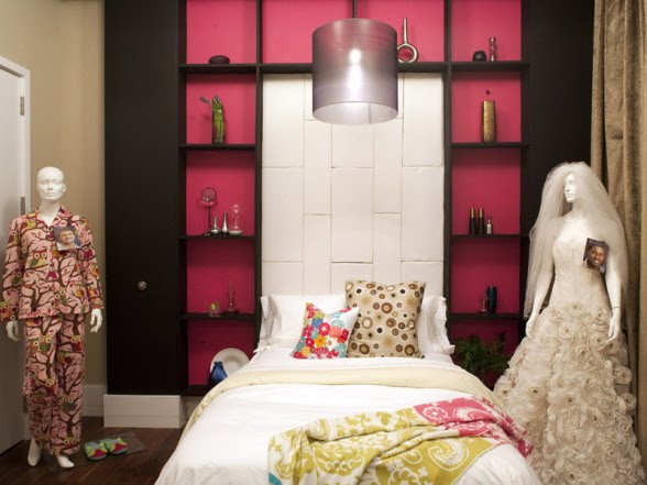
Yes, I get it...I believe the color wash was done only on the bedroom area that you can see in the background. I would have liked to have seen sheers flanking the back of the bed on the entire wall which really would have helped with the romantic feel...or even by using a great Donghia floral for panels...maybe too literal considering the challenge I suppose. Overall, I liked it and the use of the sheer fabric separating the sleeping and living areas feels sweet and special.


"Stacey is inspired by the carnation. She sees it as a beginning moment perfect for a studio apartment, where most people start when they move to New York City. She incorporates a wood desk and simple white chair with romantic legs to represent her flower. What do you think of her design?". (hgtv)

I have mixed feeling on this one. I actually like the idea of the carnation being a beginning. When you're young and broke...or just broke...carnations in tightly formed arrangements are a great answer for the pocket book. And, when you're starting out, most of us can't afford a home office even though we're often forced to take work home with us. So, I like the idea of the desk and I'm always a fan of this furniture arrangement...the desk behind the sofa in lieu of just a sofa table. Way more functional but serves the same purpose. I also like the selection of the white chair...a take-off on a Louis Ghost Chair. So, overall, nice. Still not amazing, though. I just don't get this season.


"Emily chose the wax flower as her inspiration because of its effortless feel. Since it's a weed, she decides to spread colorful and patterned pillows across the entire space to represent its behavior. Do you like Emily's take on the wax flower?". (hgtv)


Could she be any prettier in an easy, breezy kind of way?

As you know, I'm a fan of Emily. So what if it's because she commented on one of my blog posts. Yeah, I'm really that easy. But, I've come to like her as a designer as well. I like her style and I can see watching her show. I will say that the idea that she simply just spread some pillows around and called it a day seems preposterous to me. I have a feeling she had her hand in alot more than just that.


"Inspired by the way daffodils grown in clusters, Dan fills one wall with a grouping of framed fabrics. Unfortunately, the judges aren't impressed with Dan's interpretation of his flower and he is sent home. Do you agree with their decision?". (hgtv)

Again, I think this team should have won which would have left Dan out of even possibly being on the chopping block...but he was and I get why. When will people learn to look out for themselves? He spent so much time working on other people's ideas that it left him with the most ridiculous wall arrangement I've ever seen. Ok. Not EVER. But, close. Come on...really? Such a sweet guy and I bet he had alot more in him than this.


"Using the orchid as her inspiration, Nina wants to infuse the apartment with structural elegance. She tapes off the walls to create the look of sophisticated molding and also comes up with the idea to add a swing in the living room for a playful vibe. What do you think of Nina's orchid-inspired design?". (hgtv)

Is she Meana or Nina? I don't even know anymore. She actually seemed fairly tolerable this episode and I liked a couple of her ideas quite a bit. Loved the swing and totally understood how it portrayed the romanticism of the orchid. I also thought that the taped off mouldings were a nice way to add some architectural interest and lend a bit of a traditional vibe. I also like the addition of the fuchsia with the blues and though I'm over her squiggly lined "artwork",  she grew on me this week. Did I just say that?


So, what'd you guys think? Are you still watching? Let's hope next week we can see an individual challenge and that Vern removes the foreign object from his rectum for long enough to see past his "If it's not clean-lined and modern I don't get it" ways.

Design Star, Episode Three


Sooooo, after being so excited that Emily, a designer on Design Star, popped in last week and commented on my post, I REALLY...I mean, REALLY wanted to love Episode 3. I wanted to be able to leave a fabulous review of the episode as a whole and of course of Emily's work. But, darn it, HGTV! You seem to be making it impossible for the viewers to really love any aspect of it this season. Gone are the high stress scenes where you, the viewer, get to feel the designers pressure and the intensity of the challenge. At least let us know where they're allowed to shop and what the budget is! I mean, is the budget $1,000, $10,000...$25,000? To me that's imperative information! If it's $25,000 then the challenge is much less challenging! And seriously, an outdoor patio challenge on episode 3? We're still trying to get to know these people and their design aesthetic...do you really think we can do that by allowing them to choose outdoor furniture and a few plants?! Argh!@!

For those of you that didn't see it, the designers walked out onto a roof-top terrace to find a bunch of musicians performing. They we're then asked to choose one of the instruments and, separated into two groups, design a small outdoor space that represented all of the instruments. Ooooo...ingenious! Not! (Yes, I just did.)

Before we know it, the designers have shopped for all their items...again, no clue about the budget and only about one minute of showing us the actual shopping...and then they get to work. Here are the before pics of the spaces:
The men's space and inspirational instruments.

The women's space + Dan

After very little shown discussion about how to create an amazing and cohesive space, the teams started working on their respective spaces. Because we didn't have a chance to really see or hear what went on during the shopping phase...you know, the reasons they thought this piece of furniture or that accessory worked for their instrument, we were left to try to figure it out. Frankly, I still thought the designs were totally uninspired for the most part and I really wouldn't want to spend much time in either space. What do you think?


Here's the ladies (and Dan's) finished space. On tv the purple looked far more aubergine and actually worked well. Meana (Nina) was the brainchild behind the color and the walls in general shown here. I agreed with Emily when she told Meana that the white squiggles were distracting and she should paint over them. I get that she was trying to create movement that the music would create, but I didn't think it was so amazing. The judges, however, did and she won the challenge. Great. Just what the mean girl needs...more confidence.
Emily had the Tuba and she chose the chaise lounge as her piece. This is what's so frustrating! Did she blow her whole budget on that one piece? Did she do anything else besides the chaise? I saw a brief glimpse of her working on a table...but with no idea how she felt that represented the tuba I was left wanting more. Talk about wanting more! Can we get a rug? Even a nice big jute rug? Can we get some side tables? Some great outdoor lighting? How about some chartreuse plants to pop that aubergine?!


I assume this is the table that Emily was working on. Did it just not translate to camera well? I mean...I think the pop of simple white and the tablescape are lovely, but inspired? Fabulous? Eh. Not so much. The back picket wall was actually my favorite. I got it and love how the varying heights of the boards makes me think of music note and that she pulled some green through the boards. She did however seem to need quite a bit of help from  Dan on their team which bugs me a bit. Is it really yours...can you really take credit for something...if you couldn't do it on your own? Not sure...at least in this kind of competition. And poor Dan, the nice guy that he is, had to suffer timewise a bit to help her. Good teamwork though.

The judges really ripped this one apart but frankly, I'd rather spend time here than in the girl's space. I thought the day bed was great and the art piece on the wall done with extension cord was interesting and I got the wink and a nod. Overall though, what bugs the hell out of me is that none of these things were showstoppers! Someone is going to get their own tv show based on these competitions so shouldn't we be in awe?! Even I as a designer want to see things that I would never think of in a million years! Inspire me! Make me want to be like you! Strive to be as good as you! Emily, if you're out there in this big ol' blogosphere, I'd love to hear some more insight into the budget constraints and what was behind your decisions. I'll be checking her blog, The Brass Petal, to see what she has to say. Oh, and by the way, if anyone wants to do something next Sunday night I'm fine with dvr-ing Design Star. I'm afraid it's no longer must-see-tv. :(

Sunday

Design Star, Episode 2...zzzzzzzzzzzz


Am I a design snob?  I think the answer is no, but why am I finding this season of Design Star so utterly uninspired and dull? "This week the designers were divided into two teams, and each was asked to design New York apartments. Their inspiration: garments from noted fashion designers. The women's team of Casey, Emily, Nina, Stacey and Tera didn't communicate well during the design process, bickered during judging and lost the challenge. Nina and Tera were judged the worst designers of the week, and Tera was eliminated. Vern advised the remaining women: "There is no room for mediocrity in this competition.'" (HGTV)
Oh! And Nina! Someone give her a lesson on social and professional interaction! She's so holier than thou and down right rude that I was praying with both hands she would get kicked off last night for shear snobbery! I was happy to have her in the bottom two after having the MOST beautiful dress as her inspiration...seriously, it was amazing...but alas, mean people stay and succeed and gentle people go. The way of the world as we know it.
The outfit on the left inspired most of this space. I use the word "inspired" here very lightly. And did anyone else think the velvet drapes...which looked peacock on camera...were an obvious miss? I do like the grey and lord knows I love a good sunburst mirror but even I have had this same mirror for going on 5 years...was there nothing more current...more out of the box?


Did anyone else watch last night? Now come on...I had over 400 hits on this darn blog yesterday so start chatting with me! Leave a comment or two...that's what we're all here for. ;)
Related Posts with Thumbnails