If you've never spent any time with a color wheel in front of you and studied (or been forced to study ;)) the different relationships between all of the different colors, then it's easy to understand why so many people get overwhelmed with how to mix them properly. Orange and blue is one of those pairs that for alot of people...unless they're Bears fans...really doesn't seem to be one that works to well. I happen to really like the duo in all of it's glorious forms and some of them might even surprise those that had never considered it before. Take a look and let me know which are your favorites and which you'd leave behind.
Laquered peacock blue walls are a statement in and of themselves, but why stop there?! Pop them with some great orange pieces and mix in a bit of mossy green to ground it and voila! Instant glamour.
(miles redd)
Well, there's just so much I think is sublime about this space...that great tree trunk table, the pendant fixture, those branches for texture, the slipcovered arm chairs mixed with the armless ones. But, most of all, I just really think this is a fresh color palette and an easy one for most people to feel comfortable with.
(via beautiful things)
Happy. Happy. Joy, Joy! That's what this design makes me feel. Turquoise and a corally or sherbet orange is such a family-friendly pairing and is a surefire way to set the stage for a good time.
(via hgtv)
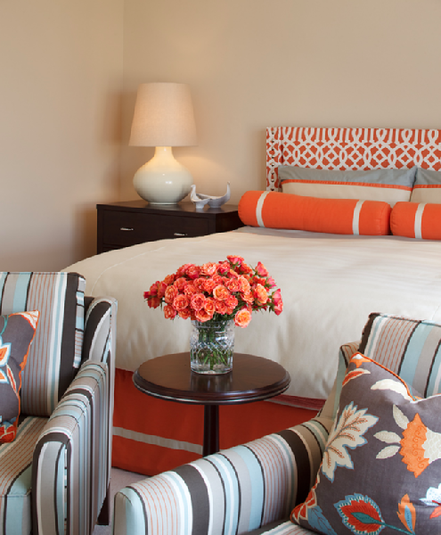
Pale beachy blue and orange? Absolutely. Blue and orange are actually complementary colors as proven by color theory and the ever famous color wheel...so we know it's tried and true. For quite a few people I work with though, they absolutely would have had to see and incorporate that fabric on the front throw pillows to help them feel comfortable with this mix of colors. By stepping outside of the "matching" box and focusing more on what works with what rather than what matches what...you're bound to begin to create far more interesting spaces. Trust me on this one.
(via decorno)
If you're looking for a more muted and less bold version of our color palette du jour, you can easily tone it down to grays with a bit of blue in them and use pumpkin instead of a brighter orange. Throw in some white and black and you've got a chic, no-fail alternative!
(house beautiful)
Imagine this space without a.) the bits of black and super-dark wood and b.) the pops of orange in both the pillows and even in the terra cotta pots on the mantle. It would fall flat and would just kinda float around without ever giving the eyes somewhere to land.
(Traditional Home)
(design sponge)
Eclectic and cool, what tween wouldn't love this?
That rug and the turquoise chair are yummy together and the pop of yellow in the throw pillow really does something for me.
(bhg)
Make sure to leave contact info along with your comments if you'd like to be eligible for any of the upcoming giveaways, please. If I can't find you...you can't win! :)


7 comments:
Jen,
I have to admit, I never leave comments, but I have to let you know I read your page everyday in anticipation of what you have posted next! I love reading your blog everyday, and your thoughts and ideas!!
Well, I'm glad you decided to leave a comment today, Mary! I used to do the same thing when I just lurked around my favorite blogs and then once I started writing mine, I realized how important these comments are to us. It makes it all worth while and allows for a sense of community even in this odd place called the blogosphere. So, I hope you continue to read and I really hope you continue to comment! :D
I love this post and I just posted this week about my introduction of orange and aqua in my living room with a tour. I love the combo - I had the aqua existing but that addition of orange really make the space pop! :)
I love, love, love orange and blue combo. This has been my most favorite combination forever!! I am currently trying to convince a client of mine to go in this direction and your pics will help make my point. If I succeed, I will be happy to share photos with you. In the meantime, my contact info is stellar50@live.com or stel@aneyefordesigninc.com. I really enjoy reading your blog.
Thanks for posting this, Jen! I think this is a sign, I JUST received today, by delivery, two chairs I had purchased to go in my dining room as a sitting area. I couldn't decide between red or orange to go in my dining room with the pale blue. So, I bought both and thought, I would see which I like better. Before purchasing, I studied the color wheel and just did some light research on line about complimentary colors, etc, and that is how I came up with orange. Anyways, I think I may stick with the orange! The hard part is, I want to keep the red and put it somewhere ELSE in my house now. ;)
I, too, LOVE reading your blog and aspire to learn more about design. I just love it!
Jen
I especially liked the pillows in the House Beautiful Room that have orange & blue on a gray background. They are on the pic with the orange/white geometric headboard. These would work perfectly in the room I am currently working on. Any ideas where this fabric is from?
I need the pillows on the white couch or the striped chairs!! We need to look for fabric for pillows since the fabric sale is coming up!
Post a Comment